━ Project Scope
My client asked me to completely redesign his brand with a new logo, business cards, letterhead, and website. His company already had a logo and Wix site, so we had a couple of meetings on what he wanted his target market to be and what changes would need to be made to try to meet that audience.
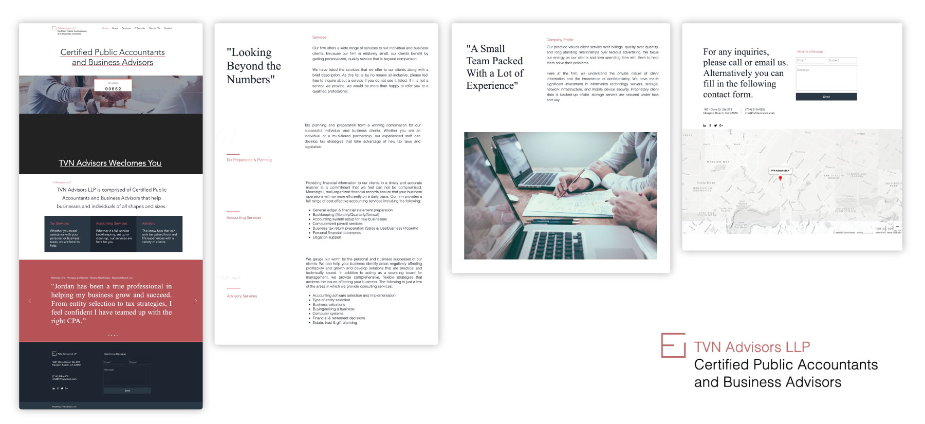
Below are samples of the old logo and website before the redesign.

━ My Process
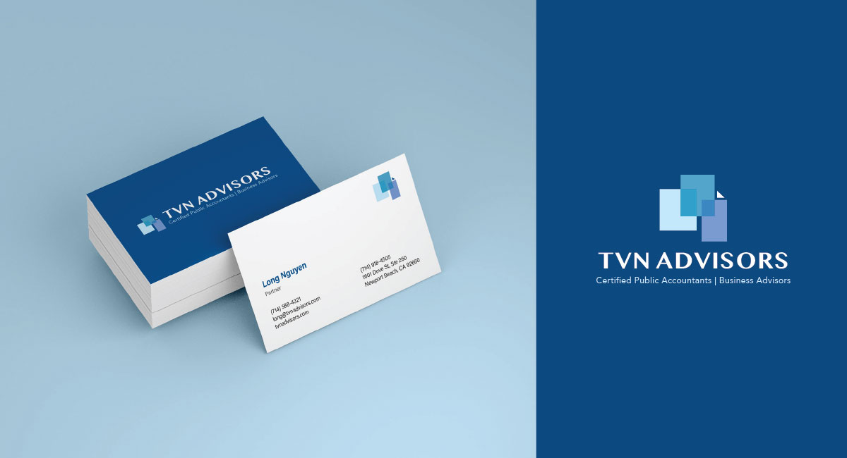
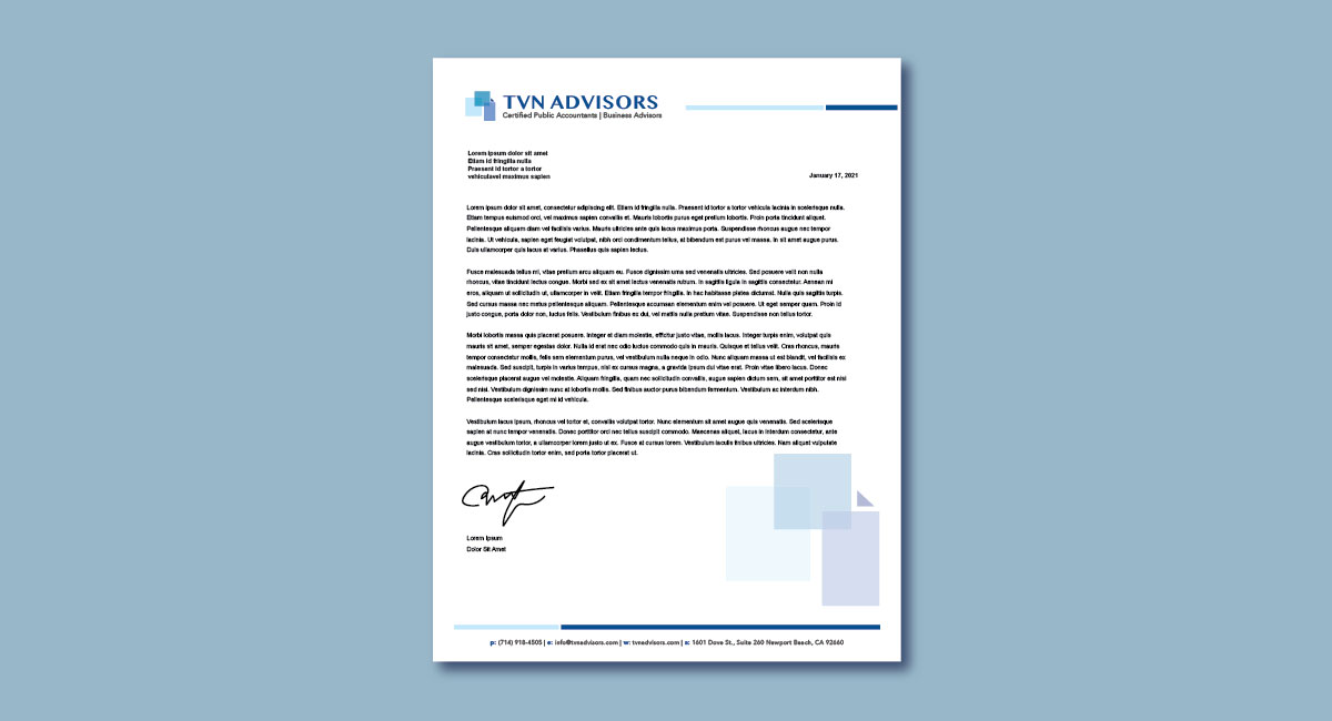
I recommended changing the colors from pink and black to different shades of blue since blue is a color that represents trust and is often used for businesses. The new logo had intersecting squares, representing the different types of services his team offered and how they worked in conjunction with one another to help individuals reach financial success.
I also changed up the fonts to be all sans-serif since he wanted to target younger, wealthy professionals. The site also uses flat, isometric images to reach the modern audience.
The logo work took quite a few iterations (around 10 different drafts) and we went back and forth between the business card layout. I’m really happy with how these turned out and excited to see how the business will grow with a fresh face!
━ The Website
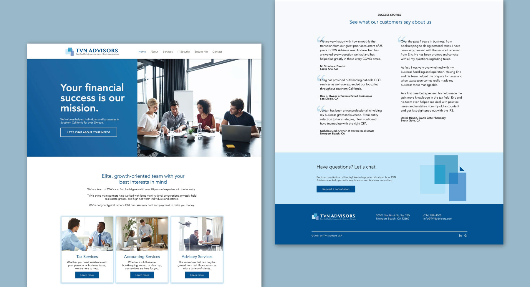
I incorporated the new branding into their Wix site, along with rewriting all the copy to be more friendly, professional, and clear.
The copy focused on building trust with new users, so I added a section on the front page containing testimonials. I rearranged sections to help current users easily navigate to pages such as Bill Pay. I added some contact forms to improve the user experience, as well as dividing up the content into sections to improve the flow of the content. I rewrote all the button CTAs to have a friendlier approach instead of the standard “submit”, and included large headlines with actionable text that relate back to building user trust.
The client eventually asked me to apply the new branding to their subsidiaries, create custom email signatures, and design new business cards.


